Better Homes and Gardens' April Color Issue hits news stands today and it includes a first-ever color palette by the company.
The group of seven colors express the "most current trends from home to fashion, in hues that work together beautifully in multiple combinations," according to a press release published by The Wall Street Journal.
Editors of Better Homes and Gardens curated the palette taking into consideration of trend forecasts and trade shows, including the Color Marketing Group's International Summit in Orlando. Fla.
The Color Marketing Group is an international non-profit with members from 20 countries that forecast color trends 19 months in advance. All types of industries take the predictions into consideration, according to the group's website.
Any professional with a need or interest in color information can apply for a membership.
The editors of Better Home and Gardens compiled their own research then made adjustments to create tones they felt were "fresh, livable and lasting."
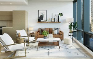
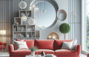
On the tablet edition of April's issue, readers can view the palette applied to sample rooms curated by the editors, mix and match colors in interactive rooms and watch how-to videos.
The group stressed the importance of making color selection as easy and simple as possible for individuals.
"There's no wrong way. it all works together and it's like they're their own interior designer," Eddie Ross, the East Coast Editor and Producer for Better Home and Gardens, said during a promotional video for the palette. "I cannot tell you the color you need to live with, you need to be happy with the colors you choose."
Here's the 2014 Better Homes and Gardens Color Palette of the Year, and suggested paints from a variety of brands.
COBALT: It's the biggest news in fashion, wearable for anyone and any room. INDIGO CLOTH 4009-7 (VALSPAR)
YELLOW: Pulled from the sun, this energetic color brings a happy mood. SUNDAY AFTERNOON T14-19 (BEHR)
LAVENDER: Pale purple with gray undertones make an easy-to-live-with cool color combo. OBI LILAC SW6556 (SHERWIN-WILLIAMS)
APPLE GREEN: This leaf-inspired hue is just like the greens in nature-a colorful neutral. ELM VALLEY B32-6 (ACE HARDWARE)
CHAMBRAY: This mid-range blue hue is timeless and looks great with anything. BLUE JEAN 2062-50 (BENJAMIN MOORE)
CORAL: This pretty poppy explores the trend of adventurous brights. HAIKU 4-7 (PRATT & LAMBERT)
BEIGE: Aim for a naturally warm-toned beige, like pebbles in sand. NAVAJO WHITE D12-1 (OLYMPIC)