The 60-30-10 Color Rule Makes Interior Design Color Schemes Easier Than Ever
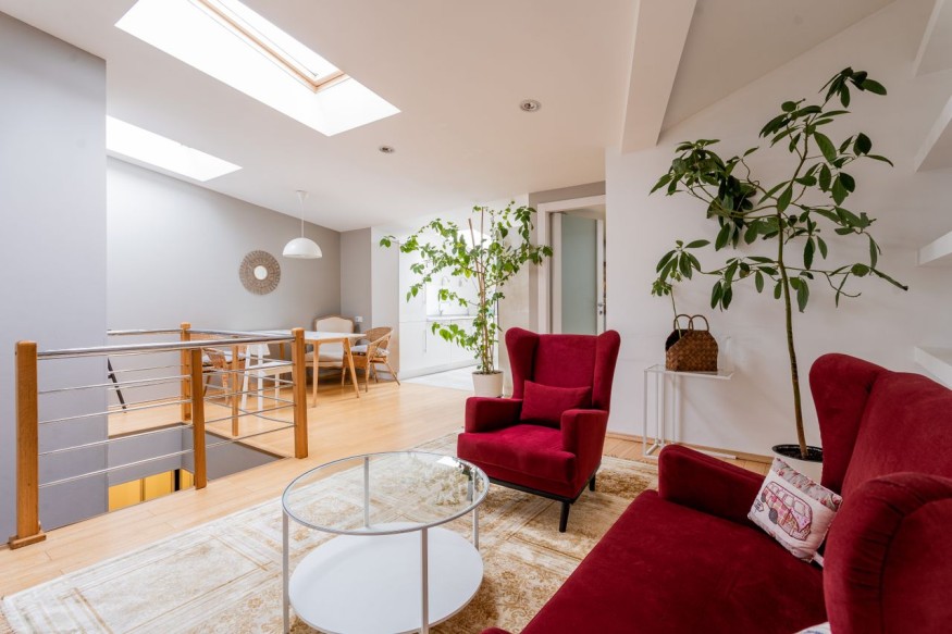
Choosing colors for a home can feel surprisingly difficult. A paint shade that looks perfect in the store may clash with furniture at home, while favorite décor pieces may seem disconnected once everything is in the same room. That is why many interior designers rely on the 60-30-10 color rule, a simple guideline that helps create balanced, visually appealing spaces without requiring advanced design knowledge.
Rather than focusing on individual colors, this approach emphasizes how colors are distributed throughout a room. The result is a cohesive look that feels intentional instead of random. Whether decorating a living room, bedroom, kitchen, or home office, the rule serves as a practical starting point for building harmonious interior design color schemes. Combined with smart home decorating tips, it can make any space feel polished and inviting.
What Is the 60-30-10 Color Rule?
The 60-30-10 color rule is a classic decorating principle that encourages a balanced mix of three colors throughout a room.
Typically, the palette consists of:
- A dominant color that establishes the room's overall mood
- A secondary color that adds depth and contrast
- An accent color that introduces personality and visual interest
Instead of filling every corner with different shades, the rule creates a clear visual hierarchy. This allows each color to complement the others while preventing the room from feeling either overwhelming or too plain.
The guideline works equally well with neutral palettes, bold color combinations, and even monochromatic interiors.
Why Interior Designers Trust This Decorating Method
Professional designers often use this technique because it simplifies one of the most challenging aspects of decorating.
Some of its biggest advantages include:
- Creates a balanced and cohesive appearance
- Makes decorating decisions easier
- Prevents one color from overpowering the room
- Helps highlight architectural features and statement furniture
- Works across many decorating styles, from traditional to contemporary
Because it is flexible, homeowners can personalize their spaces without losing visual harmony.
How to Apply the 60-30-10 Color Rule in Any Room
Using the rule does not require buying all new furniture or repainting every wall. It simply means assigning different roles to colors already present in the room.
Start With the Dominant Color
The primary color usually appears on the largest surfaces.
Examples include:
- Walls
- Large rugs
- Flooring
- Sofas
- Large cabinetry
Neutral shades such as warm white, beige, greige, taupe, and soft gray remain popular because they pair easily with many accent colors. Rich colors like olive green, navy, or charcoal can also work beautifully for homeowners seeking a more dramatic atmosphere.
Add a Supporting Color
The second color introduces variety while complementing the primary shade.
It often appears in:
- Accent chairs
- Curtains
- Bedding
- Built in shelving
- Area rugs
- Window treatments
This layer helps break up large areas of the dominant color without making the room feel busy.
Finish With Accent Colors
Accent colors bring personality into the space.
These smaller details might include:
- Throw pillows
- Artwork
- Decorative vases
- Table lamps
- Fresh flowers
- Decorative books
- Candles
Accent pieces are also the easiest elements to update with changing seasons or design trends.
Interior Design Color Schemes That Always Work
The beauty of the 60-30-10 color rule is that it supports nearly any palette.
Some timeless combinations include:
- Warm white with camel and forest green
- Beige with terracotta and black
- Navy with cream and brass
- Sage green with natural wood and soft ivory
- Charcoal with light gray and mustard
- Dusty blue with sand and coral
Texture also plays an important role. Linen, leather, wood, woven baskets, and natural stone add richness even when the palette remains relatively simple.
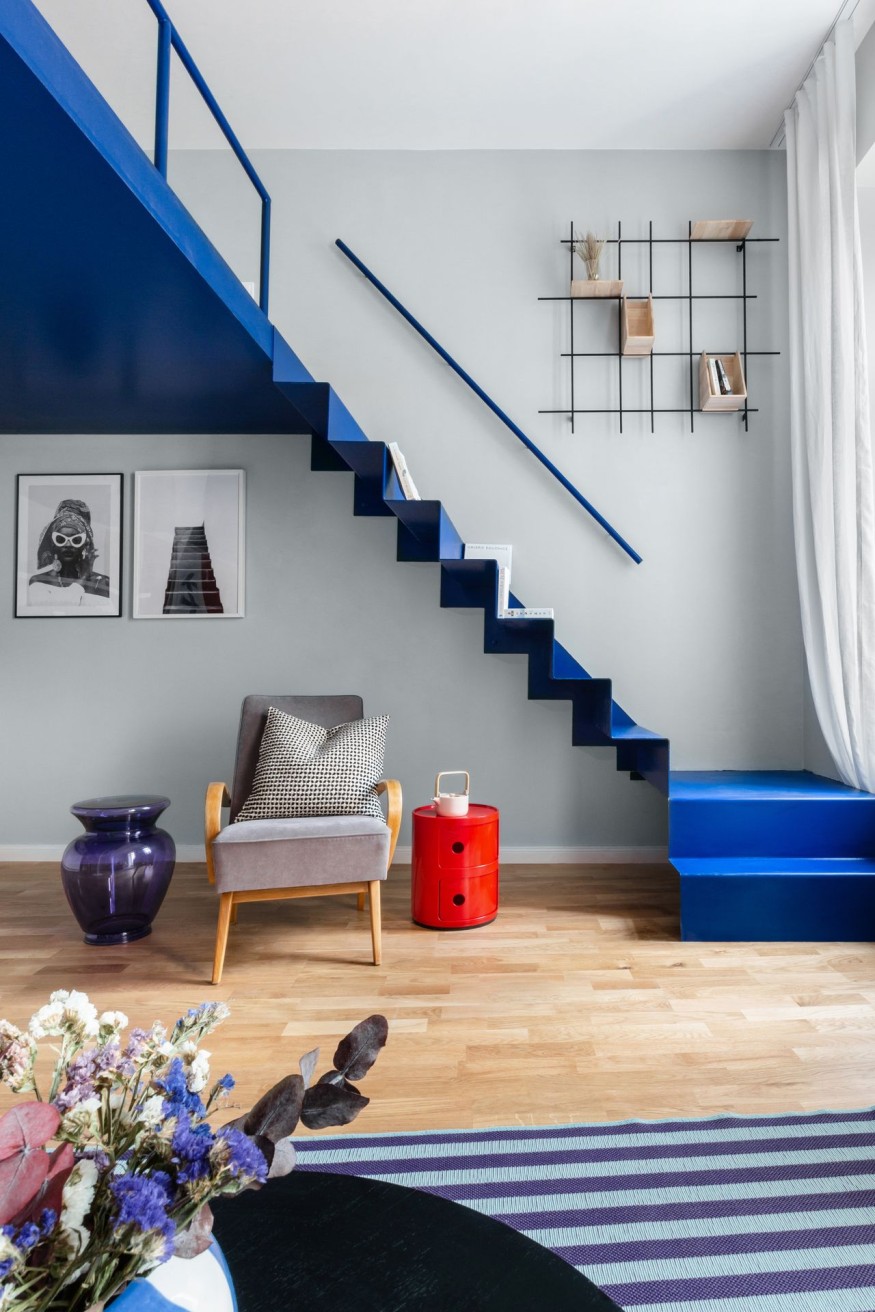
Applying the Rule Throughout the Home
Every room has unique functional needs, but the same decorating principle can still apply.
Living Room
A neutral sofa and walls can establish the foundation, while colorful cushions, artwork, and decorative accessories provide contrast.
Bedroom
Soft bedding and wall colors create a restful atmosphere. Accent pillows, throws, and bedside décor introduce warmth without overwhelming the space.
Kitchen
Cabinetry often serves as the dominant color, while countertops, backsplashes, and bar stools contribute supporting shades. Decorative bowls, plants, and cookware provide pops of color.
Dining Room
Dining chairs, artwork, table linens, and lighting fixtures help layer colors while maintaining a cohesive appearance.
Home Office
A calming backdrop paired with wood furniture and colorful office accessories creates a productive yet inviting workspace.
Common Mistakes That Can Disrupt a Color Palette
Even carefully selected colors can feel disjointed if they are not distributed thoughtfully.
Some common decorating mistakes include:
- Introducing too many competing accent colors
- Ignoring warm and cool undertones
- Choosing colors without considering natural light
- Matching every item exactly instead of adding contrast
- Forgetting that texture contributes to visual balance
- Allowing one bright color to dominate every corner
Evaluating paint samples in morning, afternoon, and evening light can prevent costly mistakes before committing to a color.
Practical Home Decorating Tips for Better Color Coordination
The 60-30-10 color rule is only one part of creating a welcoming home. These additional home decorating tips can elevate the final result.
- Build the palette around a favorite rug, artwork, or upholstered piece.
- Repeat accent colors in several areas to create continuity.
- Mix materials like wood, glass, metal, and fabric for added dimension.
- Incorporate greenery to soften hard surfaces and introduce natural color.
- Leave some visual breathing room rather than filling every surface with décor.
- Refresh accessories seasonally instead of redesigning the entire room.
These simple updates allow homeowners to experiment with trends while preserving a timeless foundation.
Why the 60-30-10 Color Rule Makes Decorating Easier
The 60-30-10 color rule remains one of the most trusted methods for creating balanced, attractive interiors because it provides structure without limiting creativity. Instead of guessing which colors belong together, homeowners can build thoughtful interior design color schemes that feel cohesive from room to room. Combined with practical home decorating tips, this timeless approach makes it easier to create spaces that reflect personal style while maintaining visual harmony.
Frequently Asked Questions
1. Can the 60-30-10 color rule work with bold colors?
Yes. Bold shades can become the primary, supporting, or accent color depending on the desired look. The key is maintaining balance so one color does not overwhelm the space.
2. Is the 60-30-10 color rule suitable for small rooms?
Absolutely. Small spaces often benefit from a balanced color palette because it helps the room feel organized and visually spacious. Lighter dominant colors can also enhance the sense of openness.
3. Can more than three colors be used in one room?
Yes. Additional shades can be introduced through patterns, artwork, and textiles, provided they complement the main palette and do not compete for attention.
4. Does the 60-30-10 color rule work with every decorating style?
Yes. Whether the home features modern, farmhouse, Scandinavian, coastal, traditional, or eclectic décor, the rule serves as a flexible guideline for coordinating colors while allowing plenty of room for personal expression.


Kohler and Aerin Lauder Introduce Delft-Inspired Floral Bathroom Fixtures

Benjamin Moore's 2027 Color of the Year Is a Nature-Inspired Green With Timeless Appeal

How to Host and Style a Party That Feels Warm, Welcoming, and Effortlessly Stylish

California Considers New Restrictions on Engineered Stone Countertops Over Silica Risks

Sherwin-Williams's 2027 Color Forecast Unveils 48 Rich Colors to Refresh Your Home in 2027


