These 7 Christmas Color Combinations Will Make Your Home Look More Festive
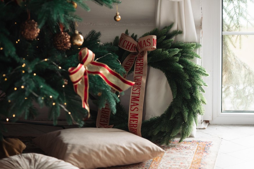
Christmas decorating does not have to follow the traditional combination of red, green, and gold. While classic holiday colors remain popular, designers increasingly embrace more expressive palettes that reflect individual interiors, seasonal trends, and the atmosphere homeowners want to create. From understated neutrals to dramatic jewel tones, the right combination can make festive decorations feel cohesive without overwhelming an existing design scheme.
A carefully selected palette also makes decorating easier. Coordinating ornaments, ribbons, greenery, table accessories, and seasonal textiles around a few complementary shades creates visual consistency throughout the home. Rather than purchasing decorations simply because they look festive, homeowners can build a collection that works together year after year.
These seven Christmas color schemes offer inspiration for creating a holiday interior that feels considered, welcoming, and stylish.
1. Classic Red, Green, and Gold
Red, green, and gold remain among the most recognizable Christmas color combinations. The palette draws inspiration from traditional holiday decorations, evergreen foliage, and the warm glow of seasonal candlelight.
To give this familiar combination a more sophisticated appearance, designers can balance deep shades with restrained metallic accents. Burgundy, forest green, and antique gold create a richer effect than brighter primary colors. Velvet ribbons, gold candleholders, and traditional glass ornaments can introduce texture without making the room appear overly decorated.
This scheme works particularly well in traditional interiors, where dark wood furniture, patterned upholstery, and warm lighting complement its classic character.
2. Burgundy, Blush, and Champagne
For a softer interpretation of Christmas decorating, burgundy, blush, and champagne offer an appealing alternative to traditional red and gold. The combination brings together rich seasonal color with delicate pink undertones and understated metallic finishes.
Burgundy provides depth, while blush introduces warmth without competing with the rest of the palette. Champagne-colored ornaments and decorative accessories add a subtle shimmer that feels more refined than highly reflective metallic decorations.
The combination works especially well with neutral walls, cream upholstery, and warm wood finishes. It can also create an elegant foundation for a Christmas dining room, particularly when repeated through table linens, floral arrangements, and candleholders.
3. Forest Green, Cream, and Natural Wood
Nature-inspired decorating continues to offer a timeless approach to seasonal interiors. Forest green, cream, and natural wood create a calming Christmas palette that feels connected to the outdoors.
Deep green provides the traditional holiday reference, while cream softens the overall appearance. Wooden ornaments, woven decorations, dried orange slices, and natural greenery reinforce the organic character of the scheme.
This combination is particularly suitable for Scandinavian-inspired interiors, rustic homes, and spaces where natural materials already play an important role. Instead of relying on glitter or elaborate decorations, the palette celebrates understated textures and simple shapes.
4. Silver, Ice Blue, and White
Silver, ice blue, and white create a winter-inspired Christmas scheme that feels crisp and contemporary. The palette references frost, snow, and icy landscapes, making it an appealing choice for homeowners who prefer cooler colors.
White ornaments establish a bright foundation, while silver introduces reflective details. Ice blue adds just enough color to prevent the arrangement from looking flat. Clear glass decorations and frosted finishes can also contribute to the winter-inspired effect.
To keep the scheme from appearing too cold, designers can introduce warm white lighting, soft blankets, and textured fabrics. These elements make the room feel comfortable while preserving the palette's clean appearance.
5. Chocolate Brown, Copper, and Caramel
Brown-based Christmas decorating offers a warmer alternative to traditional metallic palettes. Chocolate brown, copper, and caramel create a layered combination that feels particularly suited to interiors featuring natural wood, leather, and earthy finishes.
Copper provides a subtle metallic accent, while caramel introduces a lighter transition between the deeper shades. Chocolate brown ornaments, velvet ribbons, and textured accessories can add richness to the Christmas tree.
The palette also works well beyond the tree. Copper candleholders, brown table linens, and caramel-colored cushions can help connect seasonal decorations to the wider interior.

6. Plum, Emerald, and Antique Gold
For homeowners who prefer more dramatic holiday interiors, plum, emerald, and antique gold create an expressive jewel-tone palette. The combination feels luxurious without depending entirely on conventional Christmas colors.
Emerald green provides a connection to traditional seasonal greenery, while plum introduces depth and contrast. Antique gold brings warmth to the combination and helps the colors feel cohesive.
Velvet ornaments, embellished ribbons, and decorative glass pieces can enhance the richness of this scheme. It is particularly effective in rooms with darker walls, statement furniture, and warm ambient lighting.
7. Black, Ivory, and Gold
Black, ivory, and gold offer a contemporary approach to Christmas decorating. Rather than relying on bright seasonal shades, this combination uses contrast and metallic details to create a polished appearance.
Ivory keeps the palette soft, while black provides definition. Gold introduces warmth and a festive finish through ornaments, ribbons, candleholders, and decorative accessories.
The scheme is especially suitable for modern interiors with clean architectural lines, monochromatic furniture, and restrained styling. To maintain balance, black should be used selectively rather than covering every decorative surface.
How to Choose the Right Christmas Color Scheme for a Home
The most successful Christmas palettes complement the existing interior rather than compete with it. Wall colors, flooring, furniture finishes, and natural lighting can all influence how seasonal decorations appear.
Before purchasing new ornaments, homeowners can consider the dominant colors already present in the room. A home with warm wood finishes may benefit from burgundy, copper, or forest green, while interiors featuring cool gray and white tones may work better with silver, ice blue, or crisp white.
It is also helpful to repeat the chosen palette across different areas. Coordinating the Christmas tree with mantel decorations, dining accessories, and occasional decorative accents creates a more intentional result.
Create a More Cohesive Christmas Interior With the Right Colors
A well-planned Christmas color scheme can transform seasonal decorating into a natural extension of a home's interior design. Whether homeowners prefer traditional red and green or more unexpected combinations such as plum and emerald, a consistent palette helps create visual harmony.
The key is to choose colors that complement existing furnishings, introduce a balance of textures, and use decorative accents with intention. With the right combination, Christmas decorations can feel festive while remaining stylish and personal.
Frequently Asked Questions
1. What are the most popular Christmas colors?
Traditional red, green, and gold remain popular, while neutrals, silver, champagne, burgundy, and earthy shades offer contemporary alternatives.
2. What are the most elegant Christmas color combinations?
Burgundy and champagne, forest green and cream, and black and gold are popular choices for creating sophisticated holiday interiors.
3. How many colors should be used when decorating a Christmas tree?
Using two or three main colors generally creates a cohesive appearance. Additional shades can be introduced through smaller accents and natural materials.
4. How can Christmas decorations match an existing home interior?
Homeowners can select seasonal colors that complement their existing furniture, wall finishes, and flooring, then repeat those shades throughout the decorations.


Meghan Trainor Puts Her Lavish Encino Estate on the Market for Nearly $18 Million

The High-Gloss Paint Trick Designers Use to Make Kitchens Look More Expensive

IKEA's New Art Collection Turns Everyday Home Decor Into Affordable Designer Art

Sherwin-Williams's 2027 Color Forecast Unveils 48 Rich Colors to Refresh Your Home in 2027

Modern Kids' Rooms Are Changing: The Kids' Bedroom Ideas Designers Want Now


