5 Cozy Living Room Paint Colors That Won’t Make Your Space Feel Smaller
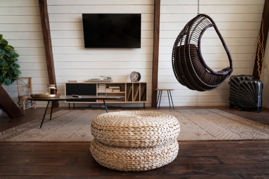
Creating a cozy living room does not necessarily require dark walls, heavy fabrics, or dramatic color schemes. While deep shades can introduce a sense of intimacy, they are not always practical for rooms with limited natural light or smaller dimensions. Fortunately, there are plenty of lighter colors that can make a living space feel warm, welcoming, and comfortable without sacrificing its sense of openness.
The secret lies in choosing shades with warm or balanced undertones. Creamy neutrals, soft greens, muted pinks, and gentle earthy colors can create a more inviting atmosphere than stark white or cool gray. When combined with natural materials, layered lighting, and comfortable furnishings, these shades help establish a room that feels relaxed without appearing visually heavy.
Interior designers often recommend considering the amount of natural light a room receives before selecting a paint color. The same shade can look completely different depending on its orientation, surrounding materials, and artificial lighting.
For homeowners looking to refresh their living rooms, these five colors offer a practical starting point.
5 Cozy Living Room Colors That Still Keep a Space Feeling Bright
1. Warm White for a Soft, Airy Foundation
White remains a popular choice for living rooms, but not every shade creates the same atmosphere. Cool, stark whites can sometimes make a room feel clinical, particularly when paired with gray flooring, glossy finishes, or cool-toned lighting.
Warm white offers a softer alternative. Its subtle cream, beige, or yellow undertones create a more welcoming backdrop while maintaining the brightness associated with lighter interiors.
This shade works particularly well in smaller living rooms because it allows natural light to move visually through the space. It also provides flexibility when introducing colorful furniture, patterned textiles, and decorative accessories.
To make warm white feel even cozier, incorporate natural wood furniture, linen curtains, textured cushions, and woven rugs. These materials prevent the room from looking flat while maintaining a light overall appearance.
2. Soft Putty for Subtle Earthy Warmth
Putty is a versatile neutral that sits somewhere between beige, gray, and brown. Unlike cooler grays, many putty shades have warmer undertones that introduce a sense of depth without making walls feel too dark.
The color is particularly useful for homeowners who want something more interesting than traditional white but are not ready to commit to a noticeably colorful room.
In a living room, soft putty can complement oak furniture, cream upholstery, natural stone, and brushed-metal accents. It also works well with layered neutral palettes, allowing different materials to create visual interest.
The important consideration is selecting a lighter version of the shade. Richer taupes can look beautiful in generously illuminated spaces, but softer putty tones are often more suitable for smaller rooms.
3. Gentle Green for a Natural, Relaxing Atmosphere
Soft green is an appealing choice for living rooms because it introduces color without feeling overly bold. Shades such as sage, celadon, and muted olive can create a connection to nature while maintaining a calm atmosphere.
Unlike saturated emerald or forest green, lighter variations are less visually dominant. They can make a room feel more interesting than a neutral scheme while preserving an airy quality.
Gentle green pairs particularly well with natural wood, cream upholstery, woven accessories, and botanical artwork. It can also complement darker furniture, provided the room has enough light to maintain balance.
For homeowners who prefer a subtle approach, green can be introduced through an accent wall, painted cabinetry, or decorative accessories before becoming the dominant wall color.
4. Plaster Pink for Gentle Warmth
Pink may not be the first color that comes to mind when decorating a living room, but muted plaster pink can be surprisingly versatile. Unlike bright or candy-colored pinks, these subdued shades often contain earthy beige or brown undertones.
The result is a color that feels warm and understated rather than overly sweet. It can introduce a gentle glow into a room while remaining compatible with natural materials and contemporary furniture.
Plaster pink works particularly well with cream, warm gray, walnut, and soft brown. Brass details and textured fabrics can add further depth without making the scheme feel overly decorative.
It is also a useful option for homeowners who want to introduce color without committing to a highly saturated shade.

5. Hushed Caramel for a Sunlit, Comfortable Feel
Caramel introduces a little more richness than traditional neutrals while remaining warmer and softer than dark brown. In a lighter variation, the shade can make a living room feel comfortable and grounded without creating a heavy visual effect.
It works especially well in interiors featuring natural wood, leather, woven materials, and cream-colored furnishings. These combinations create a relaxed atmosphere that feels particularly suitable for spaces intended for entertaining and unwinding.
Caramel can also be introduced through a feature wall or smaller architectural details if homeowners are hesitant to use it throughout the room.
In rooms with limited natural light, choosing a lighter caramel shade and balancing it with warm white trim can help prevent the space from feeling too enclosed.
How to Choose the Right Cozy Color for a Living Room
The best living room paint color depends on more than personal preference. Natural light, room orientation, flooring, furniture, and existing finishes all influence how a shade appears.
North-facing rooms, for example, can receive cooler natural light, making warm whites, putty, and caramel particularly appealing options. Rooms with stronger sunlight may accommodate softer greens and pinks without losing their brightness.
It is also worth testing paint samples before committing to an entire room. Apply samples to different walls and observe them throughout the day, including under the artificial lighting used in the evening.
Paint manufacturer Benjamin Moore's living room color inspiration guide offers additional ideas for choosing shades according to the atmosphere homeowners want to create.
Color alone, however, will not make a living room feel cozy. Texture and lighting are equally important. A combination of soft upholstery, layered rugs, curtains, natural wood, and warm lamps can make even a relatively simple neutral palette feel inviting.
For more inspiration, Homes & Gardens' guide to lighter cozy living room colors explores how warm whites, gentle greens, putty, and other understated shades can introduce comfort without relying on dark paint.
Ultimately, a cozy living room does not have to feel enclosed or dramatically decorated. The right lighter shade can create warmth, while thoughtful furnishings and materials make the space feel complete.
Frequently Asked Questions
1. What is the best light color for a cozy living room?
Warm white is one of the most versatile choices because it maintains brightness while introducing a softer atmosphere than stark white. Putty and light beige are also excellent options.
2. Do warm colors make a small living room look smaller?
Not necessarily. Lighter warm shades can make a small room feel comfortable without appearing enclosed. The key is choosing an appropriate depth of color and balancing it with natural light.
3. What colors should be avoided in a small living room?
There are no universally unsuitable colors, but very dark or highly saturated shades can dominate a small space when used without sufficient natural or artificial lighting. Testing samples before painting is recommended.
4. How can a living room feel cozy without changing its wall color?
Introduce textured cushions, soft throws, layered lighting, area rugs, natural wood, and warm-toned accessories. These elements can make a room feel more welcoming without requiring a complete repaint.


IKEA Reveals Its 2027 Color of the Year, and It's a Bold New Direction for Interiors

Brussels Furniture Fair 2026 Showcases New Collections and European Design

Lady Gaga's Former NYC Penthouse in the Historic Hit Factory Lists for $6.995 Million

2027 Home Trends: The Design Features Zillow Says Are Gaining Popularity

Designers Reveal the Old-School Decorating Trends Gen Z Is Moving Away From


