Is 2016 Interior Design Making a Comeback? What the Nostalgia Trend Reveals
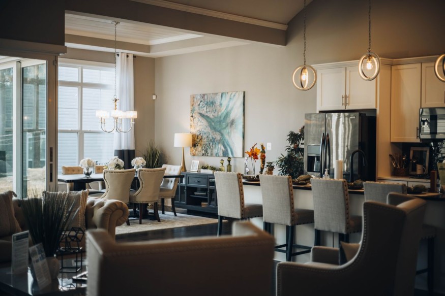
The year 2016 has unexpectedly become a cultural reference point again. Across social media, people are revisiting the music, fashion, beauty trends and internet culture associated with the era. The nostalgia has also reached the home, prompting a renewed interest in some of the decorating ideas that defined the mid-2010s.
The timing is notable. Ten years after 2016, some of its most recognizable interior trends are resurfacing, from expressive color and statement lighting to layered textiles and more personalized rooms. However, the current revival is not necessarily about recreating a 2016 home exactly. Instead, designers and homeowners are selectively borrowing the era's appetite for personality while leaving behind some of its more overly coordinated tendencies.
Why 2016 Is Coming Back in the First Place
Part of the appeal comes from the passage of time. A decade provides enough distance for a period to feel distinct, even when it was relatively recent.
Vogue identified 2016 nostalgia as one of the first major cultural trends of 2026, noting that social media users were revisiting everything from old celebrity photographs to beauty products and internet trends. The appeal is less about recreating every detail of the year and more about reconnecting with the emotional atmosphere people associate with it.
That distinction matters for interiors. The mid-2010s were characterized by a willingness to experiment with color, pattern and decorative accessories. Homes often looked more collected and expressive than the ultra-restrained spaces that became prominent later in the decade.
The result is a useful contrast with today's increasingly personalized approach to interiors.
Color Is Returning With More Confidence
One of the clearest connections between 2016 and current interiors is color. Rose Quartz, better known as millennial pink, was one of Pantone's Colors of the Year for 2016. Blue was its companion shade, Serenity. Around the same time, interiors were embracing jewel tones, blush shades, deep blues and other colors that created a stronger visual identity.
The current interpretation is more nuanced. Rather than covering an entire room in millennial pink, homeowners may use blush, dusty rose or muted terracotta as an accent. Jewel tones can appear through upholstery, artwork or cabinetry rather than dominating every surface.
This makes the nostalgia easier to incorporate without making a home look like a time capsule.
Statement Lighting Is Having Another Moment
Lighting was another defining feature of the mid-2010s. Oversized pendants, sculptural lamps and decorative fixtures were increasingly treated as design objects rather than purely functional necessities.
That idea remains relevant in 2026. The difference is that statement lighting is increasingly being combined with layered illumination. A sculptural pendant may provide a visual focal point, while table lamps, wall sconces and dimmable accent lighting create a more flexible atmosphere.
This approach reflects a broader shift toward homes that are designed around experience rather than photography.
Patterns and Layering Are Reappearing
The mid-2010s were not afraid of pattern. Geometric rugs, botanical prints, graphic wallpaper and mixed textiles were common ways to give rooms personality.
Some of those ideas are returning, but with greater restraint. Instead of coordinating every pattern around the same visual theme, designers are increasingly mixing different scales and textures. A patterned rug might sit beneath a plain sofa, while artwork and cushions introduce smaller references to the room's colors.
The objective is not perfect coordination. It is visual depth. That shift also helps explain why the current revival can coexist with contemporary design. A traditional room can incorporate a geometric pillow, while a minimalist space can gain character from one patterned chair or a colorful rug.
The New Version Is More Personal
Perhaps the biggest difference between the original 2016 aesthetic and its 2026 interpretation is personalization. The earlier era was heavily influenced by Pinterest and Instagram, which helped spread recognizable decorating formulas. Certain objects, color combinations and styling techniques became widespread because they photographed well.
Today's interiors are increasingly interested in individuality. That means a 2016-inspired room does not need to include every recognizable trend from the period. A homeowner might instead choose one element that has personal meaning, such as a vintage lamp, colorful artwork, patterned upholstery or a familiar material.
This makes nostalgia a starting point rather than a decorating prescription.
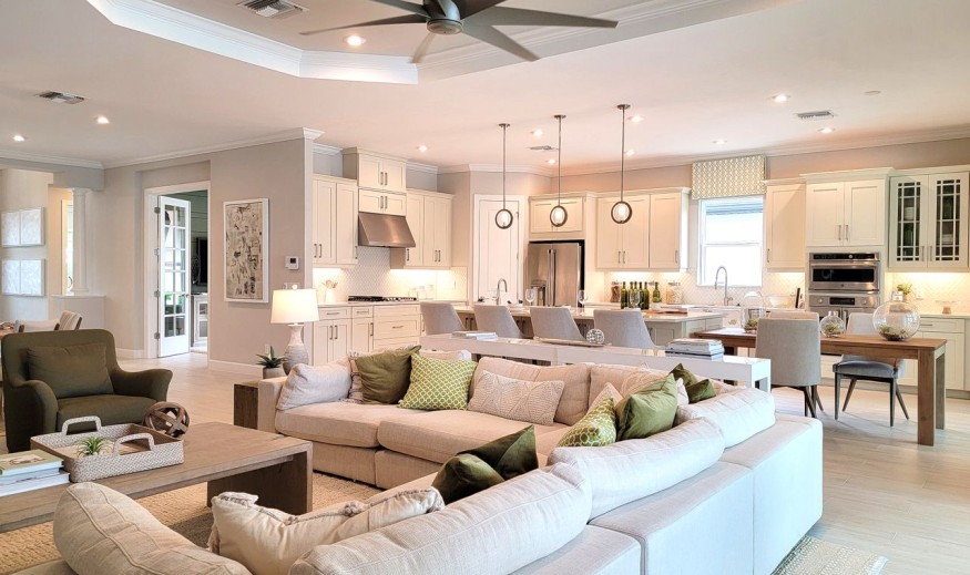
How to Bring 2016 Nostalgia Home Without Recreating 2016
A contemporary interpretation works best when it focuses on atmosphere rather than imitation.
- Choose one nostalgic color. Try dusty pink, teal, cobalt or another saturated shade as an accent.
- Add a statement light. Look for an interesting silhouette rather than an exact reproduction of a 2016 fixture.
- Mix patterns selectively. Combine one strong pattern with quieter textures.
- Bring in vintage pieces. A secondhand lamp, chair or frame can create genuine character.
- Keep the modern foundation. Contemporary furniture and natural materials can prevent the room from feeling overly themed.
The broader lesson is that nostalgia can be useful in interior design when it is filtered through current lifestyles.
Why the 2016 Revival Could Make Homes Feel More Personal
The return of 2016-inspired interiors is less about bringing back every trend associated with the year and more about reconsidering what those trends represented. Color, pattern, decorative lighting and collected objects all communicate a willingness to let a home have a personality.
After years in which highly edited interiors dominated design conversations, that renewed appetite for expression is significant. The 2026 version of 2016 does not need to look exactly like the original. It can simply borrow its sense of fun, then combine it with today's emphasis on comfort, sustainability and individuality.
Frequently Asked Questions
1. Why are people nostalgic for 2016?
The year has become a major nostalgia reference on social media in 2026, partly because it is now a decade in the past. Cultural commentary has linked the trend to memories of a less fragmented internet and a more recognizable shared online culture.
2. What 2016 interior trends are returning?
Color, statement lighting, layered patterns, metallic accents and more expressive decorating are among the trends being revisited.
3. Is millennial pink coming back?
Pink is appearing again in interiors, but current applications tend to be more nuanced. Dusty, muted and deeper pinks can provide a contemporary interpretation of the 2016 millennial-pink phenomenon.
4. How can 2016 trends look modern?
Using one or two nostalgic references alongside contemporary furniture, natural materials and restrained styling can create a current interpretation rather than a literal recreation.


Staud Home Has Arrived With Playful Ceramics, Leather Goods and More

Don't Leave Your Empty Fireplace Bare: Designers Share What to Do Instead

The Essential Guide to Designing a Root Cellar for Winter Produce

5 Home Decor Items Interior Designers Skip, and What They Choose Instead

10 Low-Light Houseplants That Can Thrive in Your Home's Shadiest Corners


