C2 Paint’s 2027 Color of the Year Is a Warm, Rosy Shade With Earthy Appeal
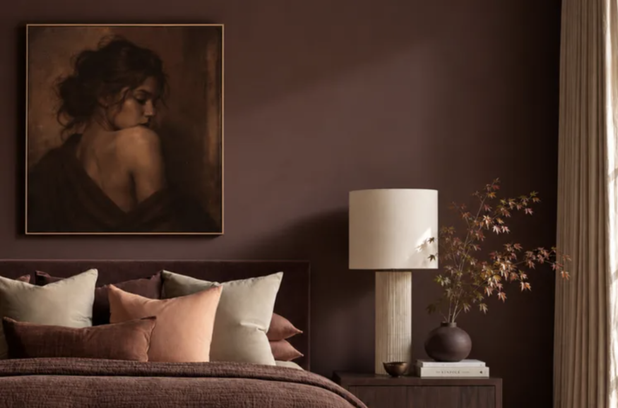
C2 Paint has named Pueblo (C2-510) its 2027 Color of the Year, introducing a complex, earthy shade that moves between rosy pink, muted plum, and warm terracotta depending on the surrounding light. Rather than reading as a traditional blush or a straightforward brown, the color offers a more nuanced approach to decorating with warmth.
The selection anchors the paint company's 2027 color story, called Rural Renaissance, which explores a renewed connection to natural materials, seasonal changes, craftsmanship, and sensory experiences at home. The palette reflects a broader interest in interiors that feel personal and tactile rather than defined by a single minimalist aesthetic.
What Makes Pueblo C2 Paint's 2027 Color of the Year Different?
Pueblo stands out because its appearance shifts throughout the day. In natural daylight, its rosy and floral undertones become more noticeable, giving the shade a soft, almost botanical quality. As the light fades, deeper brown and terracotta notes emerge, making it appear warmer and more enveloping.
This variation gives Pueblo a distinctive position between pink-based neutrals and traditional earth tones. It can provide the softness associated with blush without appearing overtly pastel, while its brown undertones lend it a grounded quality that can work in both contemporary and traditional interiors.
The color's relationship with light is central to its appeal. In a bright room, it may feel expressive and relatively light. In a room with limited daylight or warm artificial lighting, it can look deeper and more intimate. The precise result will depend on the room's orientation, existing finishes, and the type of lighting used.
C2 Paint's Rural Renaissance concept places the shade within a wider design direction that favors natural textures, meaningful objects, and colors that evolve with their surroundings. Rather than treating paint as a neutral backdrop, the approach gives it a more active role in shaping a room's atmosphere.
How to Decorate With Pueblo at Home
Pueblo can be used in different ways depending on the desired effect. A full room painted in the shade can create a cohesive, enveloping atmosphere, while a smaller application can introduce warmth without requiring a major design commitment.
In bedrooms, the color could work behind a bed or across all four walls, particularly when paired with natural wood furniture, textured bedding, and understated lighting. Its rosy undertones can soften a space, while its earthier qualities prevent the overall look from feeling overly sweet.
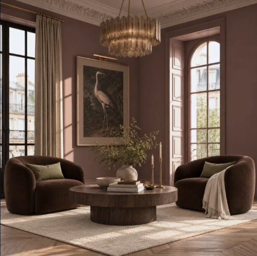
Living rooms offer another opportunity to use the shade. Pueblo can complement walnut furniture, leather upholstery, woven accents, and natural stone. These materials reinforce its earthy character while creating contrast through differences in texture and finish.
For homeowners hesitant to commit to a strong wall color, smaller applications may be more practical. A painted alcove, built-in shelving unit, interior door, or architectural detail can introduce the hue while leaving the rest of the room relatively neutral.
The shade may also suit dining rooms and reading areas, where a deeper, warmer atmosphere can be desirable. However, the effect should be tested in the actual space before committing to a large application.
Colors and Materials That Complement Pueblo
The Rural Renaissance palette offers several directions for coordinating Pueblo. Rich chocolate brown can emphasize its darker undertones, while muted greens can bring out its more botanical side. Softer coral shades provide another option for a warmer, more tonal combination.
Natural materials can help keep the color balanced. Oak and walnut introduce visible grain and depth, while linen, wool, and woven fibers provide a softer counterpoint to painted surfaces. Stone, aged metal, and handmade ceramics can add variation without competing with the wall color.
For a restrained interior, Pueblo can be combined with warm whites, sandy beige, and subdued taupe. Those lighter colors help prevent the room from feeling visually heavy while allowing Pueblo to remain the focal point.
A more expressive scheme could combine the shade with dark wood, patterned textiles, and muted green accents. The key is to create contrast through both color and texture rather than introducing too many competing statement elements.
How to Test Pueblo Before Painting
Because Pueblo changes with the light, choosing a paint color from a small digital image or printed sample can be misleading. A sample should be tested on the wall or on a large movable board within the room where it will be used.
Observe it in the morning, afternoon, and evening, with both natural and artificial lighting. It is also useful to view the color beside flooring, furniture, curtains, and other finishes that will remain in the space.
Homeowners should consider the room's orientation and the amount of daylight it receives. A shade that appears soft and rosy in a bright room may feel significantly deeper in a darker space. Testing the color under the lighting conditions in which the room is normally used provides a more realistic indication of the finished result.
Pueblo's appeal ultimately lies in its ability to occupy several visual categories at once. Its mixture of rose, plum, brown, and terracotta makes it more complex than a conventional blush, offering a warm, adaptable option for interiors that embrace color without sacrificing a connection to natural materials.


From Craft Rooms to Music Studios: Why Dedicated Hobby Spaces Are Trending

Dr. Phil Lists Beverly Hills Mansion for $67.5 Million, More Than Double Its Purchase Price

From Bold Paint to Wood Paneling: Ceiling Ideas That Elevate Interiors

The Best Flooring Transitions for a Seamless Look Between Different Materials

How to Use Floating Furniture to Create Zones in an Open-Plan Home


