The Framing Trick That Makes Everyday Posters Look More Expensive
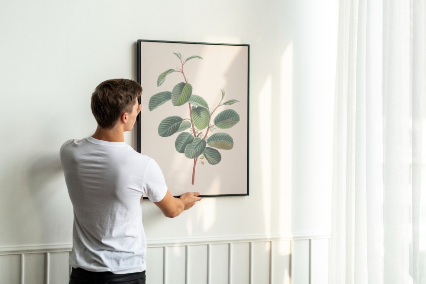
Expensive artwork is not the only way to give a home a sophisticated appearance. Sometimes, the difference between a poster that looks like a temporary decoration and one that feels like a carefully selected art piece comes down to how it is framed and displayed.
Posters have long been an accessible way to introduce personality into interiors. From vintage movie advertisements and concert memorabilia to graphic illustrations and photographic prints, they offer an affordable alternative to original paintings and limited-edition artwork.
However, inexpensive prints can sometimes look unfinished when displayed in flimsy frames or attached directly to walls. Designers suggest that thoughtful presentation is what gives these pieces a more polished appearance.
The secret is not necessarily spending more on the artwork itself. Instead, attention should be given to the frame, matting, proportions, and relationship between the poster and its surroundings.
Invest in a Frame That Looks Substantial
One of the easiest ways to elevate a poster is to replace thin plastic or clip-on frames with something more substantial.
A well-made wooden frame, understated metal border, or vintage-inspired design can immediately make an inexpensive print appear more intentional. The frame creates a visual boundary that separates the artwork from the surrounding wall and gives it a finished appearance.
The material should complement the character of the poster. Natural wood works particularly well with botanical prints, vintage illustrations, and photography. Black metal frames can emphasize graphic compositions, contemporary typography, and monochromatic imagery.
For more traditional interiors, antique-style frames with subtle ornamentation can introduce an unexpected contrast when paired with contemporary posters.
According to House Beautiful's designer framing advice, replacing flimsy frames with more substantial materials is one way to give posters a more sophisticated presentation.
However, an expensive-looking frame does not necessarily need to be elaborate. A simple, well-proportioned frame often looks more refined than an overly decorative option that competes with the artwork.
Generous Matting Creates a Gallery-Like Appearance
Another detail that can dramatically change the presentation of a poster is the mat.
A mat is the border placed between the artwork and its frame. Beyond providing visual separation, it creates breathing room around the image and can make a relatively small print appear more substantial.
A generous white, cream, or warm-neutral mat is particularly effective for colorful or visually busy posters. It allows the artwork to stand out without making the overall presentation feel overwhelming.
The proportions matter. A very narrow mat may not provide enough separation, while an excessively wide one can make a small poster appear disconnected from its frame.
The appropriate width depends on the dimensions and composition of the artwork. Smaller prints can often benefit from wider borders, while larger pieces may require more restrained matting.
Choose Colors That Complement the Artwork
Color coordination is another way to make framed posters look more sophisticated.
Instead of selecting a frame simply because it matches the furniture or wall color, designers recommend considering the artwork itself. A frame can echo one of the less prominent colors in a print, creating a subtle connection between its different elements.
For example, a vintage travel poster featuring blue skies and warm architectural tones might look particularly attractive in a dark walnut frame. A minimalist black-and-white photograph could benefit from a thin black frame and a generous white mat.
This approach creates visual cohesion without requiring every decorative element in a room to match.
Homeowners should also consider the wall color. Light-colored walls provide a neutral background for darker frames, while deeper shades can create a dramatic setting for artwork with lighter borders.
Treat Posters Like Part of a Collected Art Display
A single framed poster can make a statement, but a thoughtfully arranged collection can have even greater impact.
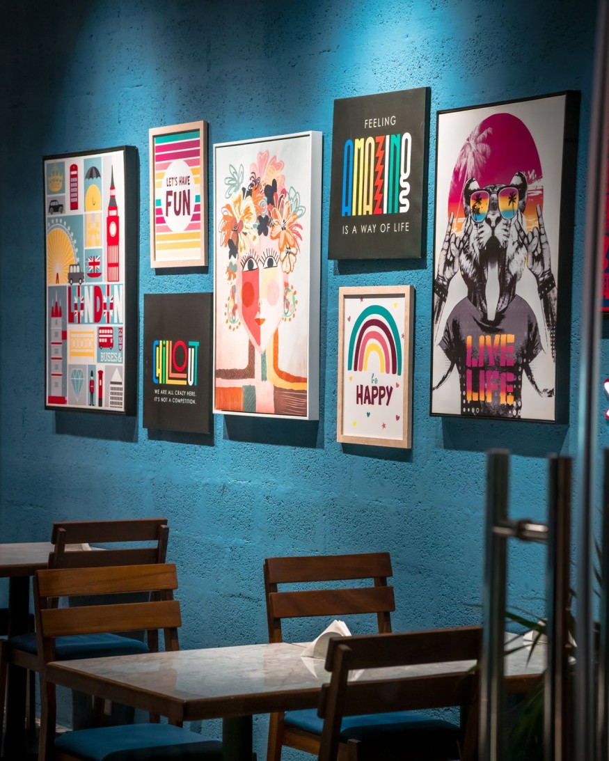
Gallery walls offer an opportunity to combine movie posters, photographs, illustrations, and other prints into a cohesive display. The arrangement should feel deliberate rather than simply filling available wall space.
One approach is to use frames with similar finishes while varying the dimensions and orientation of the artwork. Another is to combine different frame styles while maintaining a consistent color palette.
For example, a collection of vintage cinema posters might look interesting in a mixture of black, walnut, and antique brass frames. The variety introduces personality while the shared subject matter creates continuity.
Spacing is equally important. Frames should have enough room between them to remain visually distinct, although the exact distance can vary depending on the size and number of pieces.
Mix Affordable Prints With More Traditional Decor
One of the most effective ways to make posters feel like genuine art is to incorporate them into a room with carefully selected furnishings and accessories.
A graphic print displayed above an antique console, for example, can create an interesting contrast between contemporary and traditional design. Similarly, a vintage movie poster can look more intentional when paired with a classic table lamp, textured upholstery, or an architectural mirror.
The contrast between affordable artwork and more traditional furnishings can make a room feel collected over time rather than purchased as a matching set.
Pay Attention to Placement and Lighting
Even a beautifully framed poster can lose its impact when it is poorly positioned.
Artwork should relate to the furniture and architectural features surrounding it. A framed print above a sofa, for instance, should generally be sized appropriately for the seating arrangement rather than appearing disproportionately small.
Hanging height also matters. Artwork displayed around eye level tends to feel more connected to the room, while pieces above furniture should be positioned with enough space to establish a visual relationship without appearing disconnected.
Lighting can further improve the presentation. Picture lights, directional wall lighting, and carefully positioned lamps can draw attention to framed posters and emphasize their textures and colors.
Homeowners should also consider protective glazing, particularly for prints displayed near windows. UV-filtering materials can help reduce fading caused by light exposure.
Affordable Artwork Can Still Look Considered
Making framed posters look expensive is ultimately about presentation rather than price. A carefully chosen frame, appropriate mat, cohesive arrangement, and thoughtful placement can transform an inexpensive print into a meaningful part of an interior.
Rather than treating posters as temporary decorations, homeowners can approach them as legitimate art pieces worthy of attention. The result is a more personal home where visual interest does not depend entirely on expensive acquisitions.
Frequently Asked Questions
1. How can inexpensive posters look more expensive?
Use substantial frames, generous matting, and thoughtful placement. Coordinating the frame with the artwork and surrounding decor can also create a more polished appearance.
2. Should posters always have a mat?
No. Some graphic prints look better in simple frames without matting. However, a mat can add breathing room and make smaller artwork appear more substantial.
3. What frame colors make posters look sophisticated?
Black, natural wood, walnut, white, and antique brass are versatile options. The best choice depends on the artwork's colors, style, and surrounding interior.


Oheka Castle, Featured in Taylor Swift's 'Blank Space' Video, Sells for $72 Million

El Niño Gardening Guide: Ways to Protect Your Lawn and Plants From Heat and Drought

Florals, Gingham, and Chintz Are Among the Biggest Pattern Trends for 2027

Céline Dion's Custom-Built Florida Mansion Sells in $12.5 Million Deal

These 6 Christmas Decorating Themes Will Make Homes Feel Extra Special in 2026


