Forget Crisp Whites. Sun-Faded Pastels Are the Summer Color Trends Everyone Wants This Season
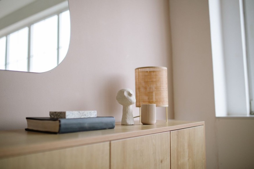
For several seasons, crisp white has been the default choice for creating bright, airy interiors. While it remains timeless, homeowners and designers are increasingly embracing a softer alternative. Sun faded pastels are emerging as one of the most refreshing summer color trends, bringing warmth, personality, and a relaxed atmosphere into living spaces without overwhelming the room.
Inspired by fabrics softened by sunlight, weathered coastal cottages, and nature's muted palette, these understated shades create interiors that feel calm, welcoming, and lived in. Unlike bold pastels that can sometimes feel playful or youthful, faded versions offer a sophisticated approach that aligns perfectly with today's preference for comfort and effortless style.
Why Sun Faded Pastels Are Defining Summer Color Trends
Every season introduces fresh colors, but this year's summer color trends lean toward shades that feel familiar rather than dramatic. Instead of stark contrast, homeowners are choosing colors with subtle depth that reflect natural light beautifully throughout the day.
Sun faded pastels capture the relaxed feeling of summer without relying on bright tropical colors. Think dusty blush, washed sage, pale lavender, muted butter yellow, and faded sky blue. These shades soften interiors while maintaining enough neutrality to complement a wide range of decorating styles.
The growing popularity of organic materials such as linen, light wood, woven fibers, and natural stone also makes faded pastels a natural pairing. Together, they create interiors that feel balanced, comfortable, and timeless.
What Colors Count as Sun Faded Pastels?
Not every pastel fits this trend. The appeal comes from colors that appear softened, almost as though they have been gently weathered by the sun.
Some of the most popular shades include:
- Dusty peach
- Powder blue
- Washed lavender
- Soft sage green
- Butter yellow
These colors work individually or together because they share the same muted quality. Rather than competing for attention, they create visual harmony throughout a room.
How to Bring Pastel Fashion Into Interior Design
Although the phrase pastel fashion usually refers to clothing, the same styling principles translate beautifully into home design. Fashion often influences interior trends, and the current preference for soft, understated colors is no exception.
Instead of filling an entire room with pastel walls, designers often layer muted tones through textiles, artwork, ceramics, and decorative accessories. A pale sage throw on a neutral sofa, faded blue cushions, or blush linen curtains can introduce color while maintaining a sophisticated appearance.
This layered approach also makes it easy to update a room seasonally without committing to permanent renovations.
How to Create a Soft Summer Style at Home
A successful soft summer style focuses on creating an environment that feels light, relaxed, and inviting rather than overly decorated. Texture plays just as important a role as color.
Natural fabrics like cotton and linen enhance muted palettes by adding depth without visual clutter. Light oak furniture, woven baskets, ceramic vases, and handcrafted accessories reinforce the calm atmosphere.
Lighting also contributes significantly. During summer, natural daylight enhances faded colors, allowing them to shift gently throughout the day. In the evening, warm lighting helps these shades maintain their cozy character instead of appearing washed out.
Are Pastels Replacing White Completely?
White continues to have an important place in modern interiors. Instead of disappearing, it is evolving into a supporting role.
Many designers now use soft white or warm ivory as a foundation while incorporating faded pastels throughout the room. This creates greater visual interest without sacrificing brightness.
For homeowners who appreciate minimalist interiors, this combination offers the best of both worlds. White provides openness while muted pastels introduce warmth and personality.
Which Rooms Benefit Most From This Color Trend?
Sun faded pastels are remarkably versatile because they work across nearly every room in the home.
Living rooms become more welcoming with pale blue cushions and blush accent pieces. Bedrooms feel restful when layered with soft lavender bedding and sage green throws. Kitchens gain character through pastel ceramics, painted cabinetry, or subtle backsplash tiles. Bathrooms benefit from calming colors paired with natural stone and light wood accents.
Home offices can also feel more inspiring with muted pastel accessories that introduce color without becoming distracting.
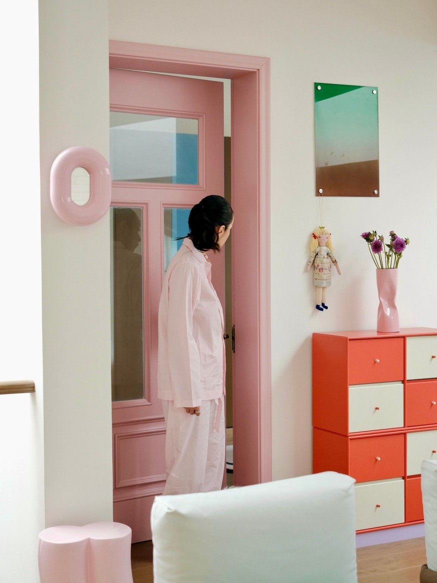
Why Soft Colors Feel Timeless
Unlike bold seasonal palettes that can quickly feel dated, faded pastels have a classic quality. Their muted appearance allows them to blend with changing design styles over time.
They also complement many popular decorating aesthetics, including Scandinavian, coastal, cottage, Japandi, contemporary, and modern farmhouse interiors. Because these shades are understated, homeowners can easily update furniture or accessories without completely redesigning the space.
Another advantage is flexibility across seasons. While they naturally suit summer, muted pastels transition effortlessly into autumn when paired with warmer woods, textured fabrics, and earthy accents.
Styling Tips for Long Lasting Appeal
The key to embracing this trend is restraint. Rather than introducing multiple bright colors, choose one or two faded shades and repeat them throughout the room using different textures.
Layering is equally important. Linen curtains, woven rugs, ceramic lamps, and upholstered furniture create depth that keeps soft colors from appearing flat. This approach results in interiors that feel thoughtfully curated instead of heavily themed.
As homeowners continue seeking comfort and authenticity, it is easy to see why faded pastels have become one of the standout summer color trends. Their gentle character offers an inviting alternative to crisp white while supporting a relaxed soft summer style inspired by nature and timeless design. Whether introduced through paint, textiles, or decorative accents, these muted hues demonstrate that subtle color can have a lasting impact. Drawing inspiration from pastel fashion, this trend proves that understated palettes can create homes that feel fresh, elegant, and effortlessly welcoming.
Refresh Your Home With This Soft Summer Style Trend
Sun faded pastels offer a gentle way to update interiors without dramatic changes. Their muted tones pair beautifully with natural materials, soft textures, and timeless furnishings, making them an easy addition to almost any decorating style. As summer color trends continue to favor relaxed, nature inspired palettes, incorporating elements of pastel fashion into home décor can create a calming soft summer style that remains inviting well beyond the season.
Frequently Asked Questions
1. What are the most popular summer color trends for home interiors?
Muted shades such as dusty peach, sage green, butter yellow, powder blue, and washed lavender are among the leading summer color trends because they create calm, welcoming spaces.
2. How can pastel fashion inspire home decorating?
Pastel fashion encourages layering soft, muted colors with natural textures. The same approach works in interiors through linens, cushions, artwork, and decorative accessories.
3. Does soft summer style only work in coastal homes?
No. Soft summer style complements many design aesthetics, including Scandinavian, modern farmhouse, contemporary, cottage, and Japandi interiors.
4. Can sun faded pastels work with existing white décor?
Yes. Soft pastels pair beautifully with white walls and furniture, adding warmth and depth while preserving a bright, airy atmosphere.


10 Low-Light Houseplants That Can Thrive in Your Home's Shadiest Corners

Staud Home Has Arrived With Playful Ceramics, Leather Goods and More

Don't Leave Your Empty Fireplace Bare: Designers Share What to Do Instead

Cold Minimalism Is Losing Ground. This Is What Designers Want Instead

The Essential Guide to Designing a Root Cellar for Winter Produce


