Little Greene Just Refreshed Its Color Card With 26 New Paint Shades
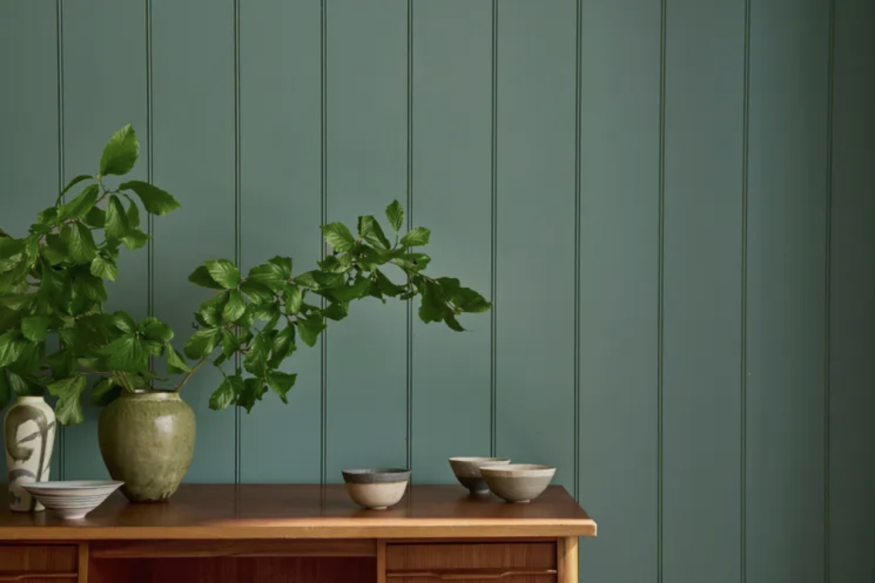
Little Greene has refreshed its celebrated color collection with an expanded palette that gives homeowners and designers more ways to work with color throughout the home. The British paint company has introduced 26 new colors across its updated Colour Card, while also bringing back the archived shade Putti.
The latest additions are not simply a collection of unrelated trend colors. Little Greene has developed the new shades to complement its existing palette, giving decorators more opportunities to create tonal schemes and connect different colors across walls, ceilings, woodwork and architectural details.
The update reflects a broader interest in softer, more nuanced interiors, where color is used to establish atmosphere rather than simply create a single dramatic focal point. According to Little Greene Creative Director Ruth Mottershead, the new colors respond to changing approaches to decorating and the way people are increasingly using color throughout their homes.
For anyone considering a decorating project this fall, the expanded collection provides plenty of inspiration. From gentle neutrals and softened pastels to richer blues and more saturated hues, the new shades can be adapted to a range of interior styles.
Little Greene's New Palette Introduces Softer Versions of Familiar Colors
One of the most notable aspects of the updated collection is the emphasis on nuanced color. Rather than relying exclusively on highly saturated shades, Little Greene has introduced colors with softer, more complex qualities.
Among the additions is Haye White, a warm white developed from an ochre base. Warm whites can be particularly useful in rooms where a stark white might feel too cool or visually flat. They can also work alongside natural wood, stone and other warm materials.
Another addition, Ashes of Marigold, provides a more muted interpretation of the existing Marigold family. This kind of variation makes it possible to introduce color without necessarily committing to the intensity of a stronger yellow.
The expanded palette also includes new shades across pink, blue, green and neutral families. This gives homeowners greater flexibility when creating rooms that combine several colors rather than relying on one dominant wall shade.
For interiors with traditional architectural details, these nuanced colors can also provide a way to highlight features such as paneling, moldings, doors and cabinetry without making them feel overly formal.
Use Related Shades to Create a More Cohesive Room
One of the easiest ways to approach the expanded Little Greene collection is to think in terms of color families rather than individual shades.
The company's Colour Scales organize related colors into graduated groups, allowing decorators to select lighter and darker versions of a similar hue. This approach can make it easier to build a room with several colors while maintaining visual continuity.
For example, a pale shade could be used across the main walls while a deeper color from the same family is applied to doors, cabinetry or trim. The effect creates variation without introducing too many competing colors.
This strategy can also work across connected spaces. A hallway might use a lighter tone while an adjoining dining room introduces a deeper version of the same color family. The rooms remain distinct while still feeling connected.
The technique is particularly useful in homes with period features, where doors, skirting boards, architraves and paneling provide natural opportunities for introducing additional color.
Stronger Shades Can Define Smaller Architectural Features
Although the new palette includes many softer options, Little Greene has not moved away from more expressive color.
Thai Sapphire, for example, is a stronger blue-purple shade that can be used when a room calls for greater visual depth. Saturated colors can be particularly effective in spaces where homeowners want a more enveloping atmosphere or a stronger contrast with lighter surrounding elements.
However, using a dramatic color does not necessarily mean covering every wall. Smaller architectural features can provide opportunities to experiment.
A deep blue could be introduced on an interior door, built-in bookcase, window seat or section of cabinetry. In a predominantly neutral room, a concentrated use of a stronger shade can create a noticeable focal point without overwhelming the space.
This approach can also be useful for homeowners who like bold colors but are hesitant to commit to a fully saturated room.
Think Beyond Walls When Choosing Paint Colors
Paint selection is often approached as a wall-color decision, but Little Greene's expanded palette can encourage a broader view of how color functions within an interior.
Ceilings, trim, doors, cabinetry and architectural features can all become part of a room's color scheme. Using different shades across these surfaces can change how the proportions and character of a room are perceived.
A ceiling painted in a related but slightly deeper shade can create a more enclosed effect, while a lighter ceiling can help maintain an airy appearance. Painting woodwork in a contrasting shade can make architectural details more prominent.
Color can also be used to connect built-in elements to the surrounding walls. A cabinet painted in a tone related to the wall color can feel integrated, while a contrasting shade can turn it into a more noticeable feature.
The important consideration is how the colors interact with the room's existing materials, including flooring, upholstery, metals and wood finishes.
Test New Paint Colors Under Real Lighting
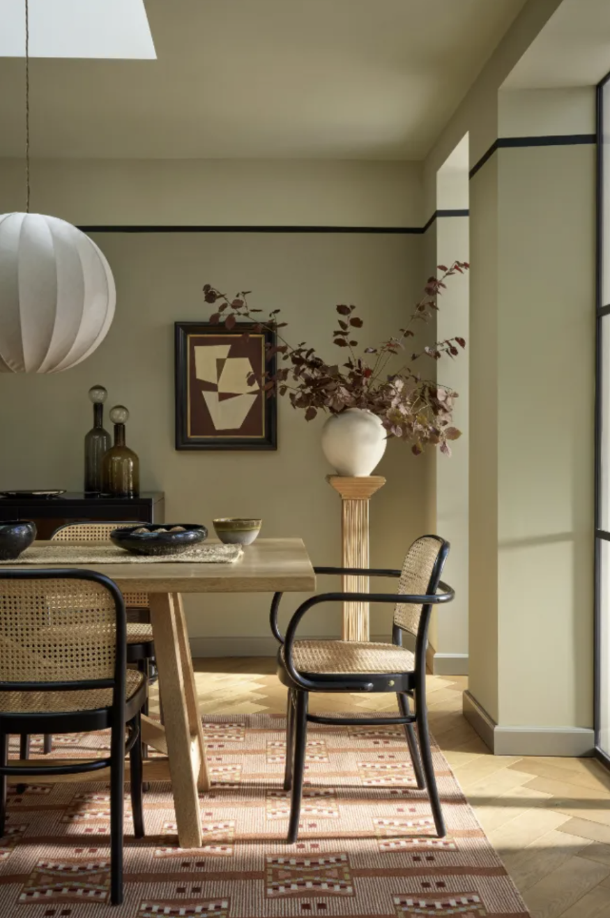
Even the most carefully selected paint color can look different once it is inside a particular room. Natural light, artificial lighting, flooring and neighboring colors all influence how paint is perceived.
A color that appears soft and neutral in a showroom may look warmer in a south-facing room or cooler in a space with limited natural light. For that reason, testing paint samples in the actual room remains an important step.
Rather than looking at a sample only once, homeowners can observe it at different times of day. Morning light, afternoon sunlight and evening lamps can each alter the appearance of the same shade.
It is also useful to test colors alongside permanent materials that will remain in the room. A paint color that looks appealing on its own may interact differently with a particular wood floor, stone countertop or upholstered sofa.
Five ways to use Little Greene's new colors at home
- Pair lighter and darker shades from the same Colour Scale for a tonal scheme.
- Use warm whites to soften rooms with natural wood or stone.
- Introduce saturated colors on doors, cabinetry or architectural features.
- Coordinate paint colors between adjoining rooms rather than treating each space separately.
- Test samples in natural and artificial light before committing to a full room.
Build a Palette That Works With the Whole Home
The introduction of Little Greene's new colors offers more than a collection of shades to consider for a single decorating project. The expanded palette provides additional tools for building relationships between different areas of a home.
A successful color scheme does not necessarily require every room to use the same color. Instead, repeating related tones, balancing warm and cool shades and using stronger colors selectively can help create a sense of continuity.
The new additions also demonstrate how increasingly sophisticated paint palettes are giving homeowners more options for working with subtle variations. Rather than choosing between neutral and bold, decorators can combine several levels of intensity within the same color family.
For homeowners planning a renovation or simply looking for a fresh direction, Little Greene's refreshed Colour Card provides plenty of possibilities. The key is to consider the entire room, test colors in real conditions and use the new shades as part of a broader palette rather than as isolated choices.
Frequently Asked Questions
1. How many new colors did Little Greene introduce?
Little Greene introduced 26 new colors as part of its refreshed Colour Card and also brought back the archived Putti shade.
2. What is the Colour Scales system?
Little Greene's Colour Scales group related shades into graduated color families, making it easier to combine lighter and darker versions of similar colors within an interior.
3. How can bold Little Greene colors be used without overwhelming a room?
Stronger shades can be concentrated on doors, cabinetry, built-ins, trim or other architectural details rather than applied across every wall.
4. Should Little Greene paint colors be tested before decorating?
Yes. Testing samples in the actual room allows homeowners to see how colors respond to natural and artificial light and how they interact with existing materials and furnishings.


Glidden's New 2027 Color of the Year Makes a Strong Case for Smoky Blue

Where Should You Put Your Bed? The Feng Shui Rule That Matters Most

The Small Design Decisions You Keep Ignoring Could Be Hurting Your Decor

No Yard? These Small-Space Succulent Garden Ideas Make the Most of Every Inch

Little Greene Just Refreshed Its Color Card With 26 New Paint Shades


